The Create Dialog and a UX Round
Spacebar opens a tabbed node creator. Plus four UX changes in one commit: richer inspector widgets, undo coalescing, copy/paste, and wire depth fading.
Some sessions are about one big feature. This one was about five smaller things that had all been quietly annoying me for weeks, and finally getting around to fixing them in a single afternoon. A new way to create nodes, plus four UX changes that each close the gap between “works” and “feels good” a little further.
The Create dialog
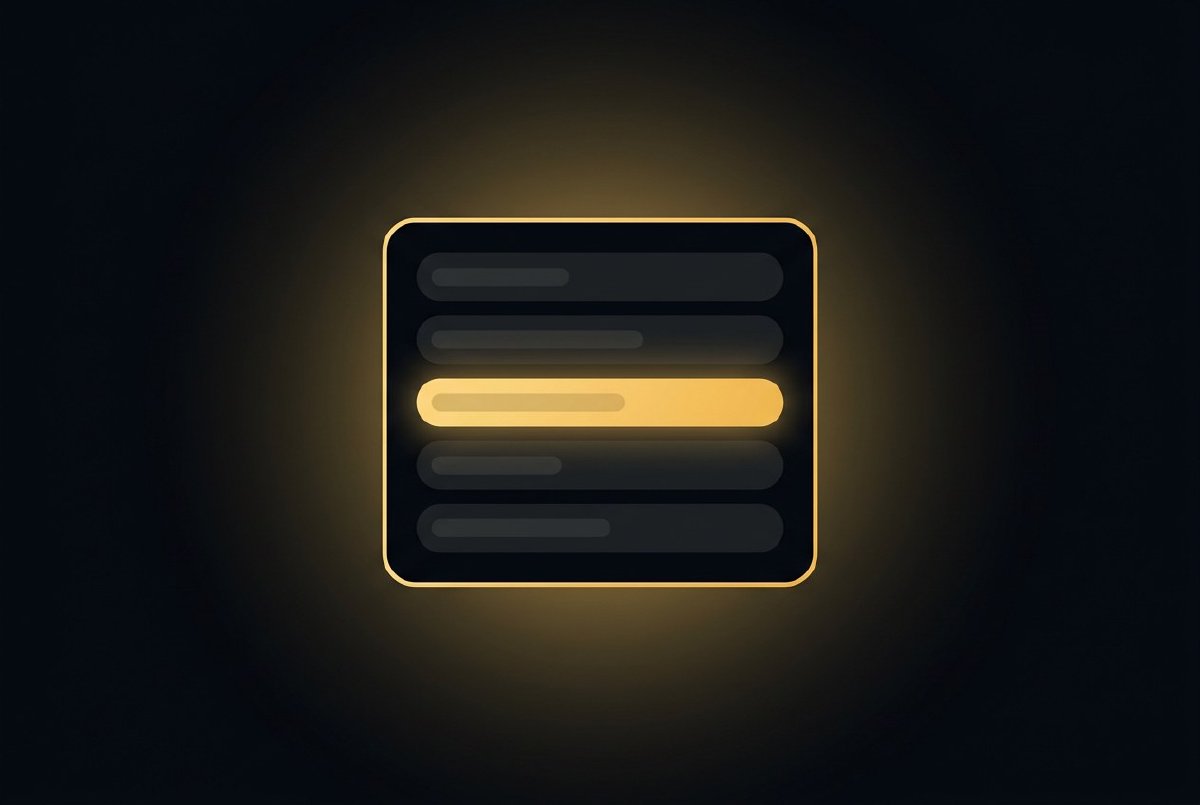
Press spacebar. A dialog pops up in the centre of the screen with category tabs across the top, a four-column grid of node names underneath, and a search box that narrows the grid as you type.
Category tabs: All, IO, Shape, Color, Anim, Math, Logic, Texture, Spread. Each tab is colour-coded by the family colour I’ve been using on the canvas accent stripes: texture nodes are purple, math is green, I/O is grey, and so on. The active tab glows. Tab key cycles through them.
The grid inside each tab is alphabetical, four columns wide, prefix-stripped. Instead of LinearSpread, LoadImage, LoadImageSequence you see Linear, Load Image, Load Image Sequence: the display names, broken into words, ordered alphabetically within each family. Click one to create a node at the centre of the canvas. Escape closes without creating anything.
This is a different animal from the Tab search popup I already had. Tab search is for “I know the name, I want it fast”: two keystrokes, fuzzy-matched, opens at the cursor. The Create dialog is for “I want to see what’s available in this category”, a browser, not a search. Different tools for different moments, and both are valuable enough to keep.
The double-tap-Shift command palette is also unchanged. Three different ways to get at the node catalog, each one optimised for a different way you might be thinking at that moment.
Richer inspector widgets
The inspector’s been pretty bare-bones. Numbers got DragValues, Bools got checkboxes, Colors got a picker, and anything else got a text field. This round added three more:
- Vec4 editor: four DragValues in a row, X/Y/Z/W labels, keeps the spacing tight so it still fits in the 220px panel. Same treatment for Vec2 and Vec3.
- Rect editor: x, y, width, height. Same row layout as Vec4 but the labels are X, Y, W, H and the width/height fields clamp to zero.
- Enum dropdown: a real ComboBox with every variant from the pin’s allowed values. If a stored value doesn’t match any variant (which can happen with old saved projects), it gracefully coerces to the first variant instead of panicking.
Pin descriptions finally show up on hover in the inspector, not just on the canvas. If you wrote .input_doc("Spring force (higher = snappier)") for the Spring’s stiffness pin, that tooltip now appears when you hover the stiffness slider in the inspector. The documentation infrastructure was already there, I just wasn’t using it everywhere.
Undo coalescing
Dragging a slider used to produce one undo step per frame. Drag a Damper’s speed from 0.1 to 10.0 over a second and you’d get sixty undo steps, each moving the value by a tiny increment. Ctrl+Z sixty times to get back to the start.
Now continuous edits on the same pin within a 300ms window coalesce into a single undo step. The old value comes from the first edit in the chain, the new value from the last. Drag a slider for three seconds and you get one undo entry: “pin was X, now it’s Y.” Ctrl+Z puts it back to X.
Any non-SetPinValue action breaks the chain. Drag a slider, click a different node, drag another slider, and that’s two undo entries, which is what you want.
This is the kind of fix that doesn’t look like anything on a diff but completely changes how undo feels in practice. Undo used to be something you avoided because it was noisy. Now it’s something you use because every step is meaningful.
Copy and paste
Ctrl+C copies the current selection: nodes plus any wires that are entirely internal to the selection, to an in-memory clipboard. Ctrl+V pastes at the cursor position with fresh IDs. Internal wires get remapped so they connect the new copies, not the originals. Ctrl+X is cut (copy then delete). Ctrl+D is duplicate (copy then paste with a small offset).
Everything is recorded as compound undo steps. Paste ten nodes and a dozen wires, hit Ctrl+Z, they all vanish in one step. Hit Ctrl+Y and they all come back. Clean.
I deliberately didn’t do cross-process clipboard (system clipboard with JSON serialisation) in this pass. That’s the next step, and it’s the one that lets you copy a patch from one Lux session to another. For now, copy/paste works within the current session, which covers 95% of what I actually want from it.
Wire depth fading
When you select a node, every wire that isn’t connected to that node fades to 25% alpha. Selected and hovered wires stay at full brightness. Glow effects on the dimmed wires get skipped entirely.
The effect is that the wires relevant to your current focus pop forward and the rest of the patch recedes into the background. In a patch with two hundred wires, this is the difference between “I can see what I’m working on” and “I’m drowning in spaghetti.”
The implementation is one boolean check per wire in the render loop. No new data structures, no extra state. The selection was already tracked for other reasons; wire fading just reads from it.
Is it a feature or a fix?
None of these are headline features. No new nodes, no new pipeline, no new rendering tricks. But the editor feels distinctly better after this round than it did before, and I think the reason is that “better” is mostly made of a hundred small things like this: widgets that know what type you’re editing, undo that doesn’t spam you, copy/paste that works, and wires that get out of your way when you’re trying to focus.
The big features get the headlines. The small ones get the feel.